COSTA COFFEE · AIRPORT SELF-SERVICE
Designing a faster way to order when every minute counts.
An end-to-end self-order experience that makes a complex, highly customisable coffee menu fast and intuitive.
Costa Coffee · Product Designer · UX/UI · Self-Service

01 - CONTEXT
Bringing self-service ordering to Costa customers
Airports create a very different ordering environment. Customers may be short on time, unfamiliar with Costa's menu, or ordering in a language that isn't their first.
At the same time, a seemingly simple coffee order can involve a surprising number of decisions, from drinks and food to size, milk, temperature, shots, customisation, loyalty and payment.
We needed to create a self-service experience that customers could understand quickly, navigate confidently and complete without needing help from a member of staff.
TIME PRESSURE
Help airport customers move through their order quickly and confidently.
MULTILINGUAL & RTL
Support customers across languages, including Arabic, where the interface needed to accommodate right-to-left reading.
COMPLEX ORDERS
Make a large and highly customisable food and drink menu feel manageable.
PLATFORM CONSTRAINTS
Create the best possible Costa experience within the capabilities of the existing self-order kiosk technology.
02 - DESIGNING FOR THE REAL WORLD
The experience couldn't be designed in isolation
We weren't starting with a blank canvas.
The kiosk ran on an existing self-order platform, so we worked closely with the team responsible for the technology to understand its capabilities, interaction patterns and limitations.
That collaboration became an important part of the design process. We needed to balance the experience we wanted to create for Costa customers with what the platform could realistically support, adapting interactions where necessary while protecting the parts of the journey that mattered most.
Internationalisation added another layer of complexity.
Supporting multiple languages wasn't simply a matter of translating content. Arabic is read from right to left, which meant considering how navigation, hierarchy and interface patterns would work when the reading direction changed.
The challenge was to create an experience that felt simple and intuitive across languages, without designing something the underlying technology couldn't deliver.

03 - UNDERSTANDING SELF-SERVICE BEHAVIOUR
Learning from experiences customers already understood
Before defining the Costa experience, I looked at how existing self-order products approached similar problems.
I visited three different self-service environments to understand how customers were guided through menu navigation, product selection, customisation, basket management and payment.
The goal wasn't to copy established kiosk patterns. It was to understand the conventions customers already recognised, where existing experiences worked well and where they introduced unnecessary friction.


04 — MAPPING THE COMPLEXITY
From first tap to completed order
I mapped the complete ordering journey to understand every decision a customer would need to make, from approaching the kiosk through to payment and collection.Seeing the journey end to end exposed where complexity could accumulate.Every additional decision, from eat in or takeaway to language, category, product, size, customisation, loyalty and payment, had the potential to slow customers down.The challenge was to organise those decisions into an experience that still felt simple.

05 — FROM JOURNEY TO INTERACTION
Designing an experience customers could move through quickly
I translated the journey into an interaction model that allowed customers who knew what they wanted to move quickly, while still supporting those who wanted to browse or customise their order.
The experience needed to support the complete journey:
• Choosing a language
• Choosing eat in or takeaway
• Navigating drinks and food
• Discovering products
• Selecting size and options
• Customising drinks
• Adding and removing products
• Reviewing the basket
• Using Costa's loyalty programme
• Completing payment
• Picking up order
I started at low fidelity, working through the structure and interaction patterns before moving into detailed design.
Throughout this process, we continued working with the kiosk platform team to make sure the experience we were designing could work within the technology.

06 — CREATING A REALISTIC TEST ENVIRONMENT
We didn't have a working kiosk, so I found a way to replicate one
To properly test the experience, I wanted participants to interact with the prototype in a way that felt as close as possible to using a real self-order kiosk.
The challenge was that we didn't have access to a working kiosk for research.
I researched ways we could recreate the touchscreen interaction and found a device that could turn a standard monitor into an interactive touch display. I proposed the setup to my manager and got approval to purchase the equipment.
We connected it to a monitor, rotated the screen into the same portrait orientation as the kiosk and used it to run the interactive prototype.
This gave us a much more realistic way to test the experience, allowing participants to stand in front of the screen and interact directly with the interface rather than clicking through a prototype on a laptop.
07 - TESTING WITH CUSTOMERS
Would customers be able to use it without help?
We invited six participants to Costa Coffee's offices in the Coca-Cola Building for moderated usability sessions.
Using the prototype on the kiosk, we observed how customers navigated the menu and completed an order.
We wanted to understand whether the experience was intuitive, validate the core flows and identify anything that could create confusion or slow customers down.

6 out of 6 participants successfully completed the tasks
6/6
Participants successfully completed the tasks.
CLEAR & EASY
Participants were able to understand and navigate the experience.
QUICKER
The kiosk was perceived as quicker and clearer than ordering at the till.
POSITIVE INTENT
The majority of participants said they would use the kiosk.
08 — FROM UX TO UI
Creating an experience that felt unmistakably Costa.
With the core experience validated, I moved into detailed UI design.
For a large touchscreen used in a busy environment, visual design wasn't simply about making the interface attractive.
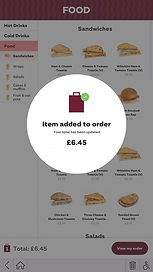
The hierarchy needed to support fast scanning. Products needed to be recognisable at a glance. Touch interactions needed to be clear, and customers needed constant confidence about what they had selected and what was already in their order.
Product photography, typography, spacing and interaction states all needed to work together to make a large menu feel approachable without sacrificing speed.
As we moved towards final delivery, Costa introduced a new visual identity.
Rather than simply applying new colours and typography, we worked across the design team to understand how the new brand could translate consistently across Costa's digital products.
For the kiosk, this meant evolving the visual language while retaining the interaction patterns and hierarchy we had already validated with customers.
The result brought more of Costa's personality into the experience without compromising the clarity and speed the kiosk needed.


09 - THE FINAL EXPERIENCE
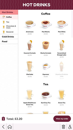
One journey, from first tap to payment
The final design brought the complete ordering experience together into one consistent system.